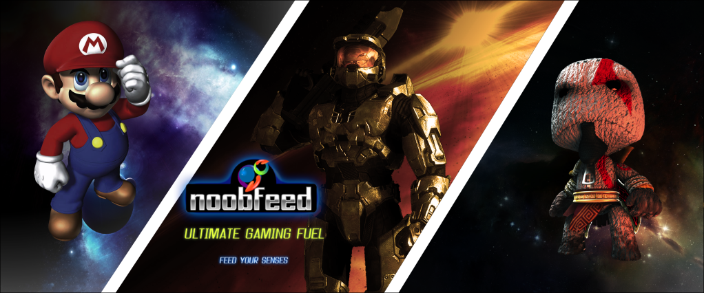
Not a final but im awaiting comfirmation from ron on the things to change and the ones to keep :) i just thought you guys would like a preview
Link to poster :)( make sure you open in new tab)
@Sleven : on all posters ive seen the logo placement is similar
@BrunoBRS : Whats so funny ?
Maybe it's only be. See Bruno already loved it 
And, don't be confused seeing Bruno's Laughing word. It's a glitch that yet to be fixed. It refers to the smile emoticon.
Very nice work, but personally I would have centered the logo but I understand why you didn't.
@dax - what the... until yesterday, i couldn't see emoticoms. now emoticoms start to show up on my posts O_o
The poster is very very good, just make the noobfeed badge/logo a little smaller.
Hey I like the new banner. Just need time to get used to. Hope that you all are doing well. Blessings of March on the way!
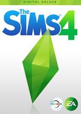
In anticipation of the upcoming expansion pack The Sims 4 Lovestruck, the offic
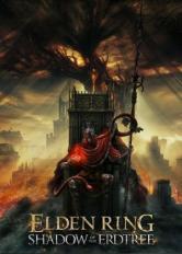
Elden Ring fans having a blast with the Shadow of the Erdtree DLC or getting ab

Ballad of Antara was revealed at the Sony State of Play May 2024 event by InFol
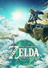
The Legend of Zelda: Echoes of Wisdom and a slew of other games from Nintendo&#
 Register with Us


The design looks good and familiar